As someone who is newer to UX writing, I realized it would be cool to share what I’ve learned about UI elements and the words to add into them. So I’m starting a series that discusses some of the most basic UI elements and what kind of UX text to write and format within them.
This is the first one in the series, so please send me any feedback about what would be helpful to you!
Let’s start off with one of the core elements everyone is familiar with: a button.
What’s a button?
A button is an element that performs an user-initiated action.
One of the best descriptions I’ve heard is that buttons “are the way a user converses with the experience.”
We’ve all used buttons (both in desktop and mobile experiences) — whether we’re saving a draft of a WordPress post, adding an item to our cart, or calculating a quote on car insurance.
What should a button look like?
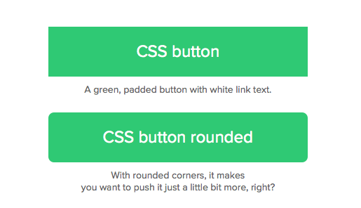
A button should look like a button — make it look like the user can select it. Imagine a button element on an arcade game. That’s how obvious the button should be.
You can accomplish this “clickable” look on buttons by adding dropshadow or an interaction on hover (like adding a border). You want it to look something different from surrounding elements.
Consider using rounded corners over sharp corners on your buttons because users perceive rounded corners as softer and more “friendly.”
Where should you use a button?
As frequent users of websites and mobile apps, most of us are familiar where buttons appear:
- Navigation
- Toolbars
- Sidebars
- Cards
- Modals
- Alerts
- Forms
Always place a button where a user wants to (or should) take an action.
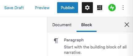
You’re probably familiar with buttons like “Add to Cart” in a shopping experience, or the “Publish” button on a WordPress post.
When should you use a button?
These buttons help the user take action on something in the experience. Provide them for any type of action, even something as trivial as “Cancel.”
However, the style of button you use will differ depending on the importance of the action. The most important action on the page should always be the most prominent button on the page — use a bold color or style to make it stand out.
What kind of text should you use in a button?
Remember that buttons are a way that the user “speaks” to the experience. Therefore, button text should always be an action verb.
Also keep button text short and succinct, either one or two words in length. If you’re using two words, I suggest using title-case (the first letter of each word is capitalized). My suggestion is only based on a personal opinion — your company’s style guide (or even your own beliefs) may say otherwise.
Those are the button basics! Hopefully you’ve learned a few things from this post, and I hope you’ll turn in for future posts on UX tool kit basics. And as always, thanks for learning along with me.
 Austin Writes Content